How to Make a Dojo Logo
- Mar 20, 2023
- 4 min read
This article was written by Valerie Lang, a member of Lemon Hill Aikido. She is a painter by trade, an artist, and an aikidoka. She spent one year creating a logo for LHA. This is the story.
As many of you know, I have a troublesome habit of playing “devil’s advocate.” But as much trouble as I like to give (on and off the mat), sometimes it’s best to give some straightforward and authentic appreciation. And so, I just want to send a little thank you to Andrés and Spencer.
I’ve done a good bit of volunteer work over the last several years—and if there was one thing that I found to be surprisingly difficult in these places of leadership, it’s this: consistency.
When life flows and changes, as life is wont to do, it’s not easy to be consistent. And yet, day in and day out, Spencer and Andrés have been navigating their lives in a way that allows them to be consistent for us. Whether we are there or not, they continually lay the groundwork, build the nest, and tend the fire—all so that we can have a consistent practice. Through their dedication and hard work, they give us the opportunity to become part of a longer lineage of Aikido practitioners.
I recently took a step back from most of my volunteer work, and have since become much more protective of my time. And yet, when I saw the community that Andrés and Spencer were building—their dedication and passion—I wanted to give back. I couldn’t give on a monetary level, but I decided that I could give back by contributing my time and skills, in much the same way they give to us.
So I offered to help them with their logo. And this is where our journey begins.
Right at the start, they had an idea: a phoenix.
Before starting this journey to start a dojo in Philadelphia, their teacher gave them a small wooden medallion, and a book—both of which involved a phoenix.
The idea of a bird rising from the ashes resonated with them. There was rebirth. There were new beginnings, and flight. There was fire.
So, we got started on the process. First, I asked them for a few examples of their favorite types of logos . . .

. . . then, I started on the sketches.


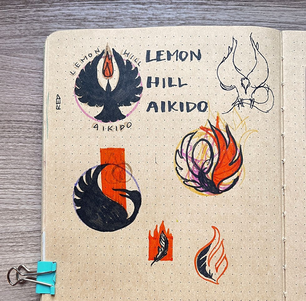
Eventually, I came to these designs:

Unfortunately, we ran into a problem. The difficulty with the phoenix idea was this: how to avoid clichés. Birds and feathers are almost as ubiquitous in logo design as trees or water. None of the logos quite struck or resonated the way we wanted them to.
We decided to start from scratch.
In July, I visited Brooklyn Aikikai and Bucks County Aikido. There, I had the pleasure of practicing with a broader network of Birankai practitioners. I reflected on the style of these dojos versus my experience at LHA. After the first day of the seminar, I went over to Andrés on the mat and said, “I don’t think it’s the bird you’re after. I think it’s the fire.”
At the conclusion of the seminar, Sensei George Lyons spoke about how Birankai draws a very particular type of person. He said Birankai is like fire—most sane people will run away from it. But those who are willing to sit in the fire eventually experience something more profound. I felt the heat.
Later, I had a conversation with Andrés and Spencer about their long-term goals and vision for the dojo. The notes I took from that meeting were pretty abstract but definitely spoke to a similar intensity of feeling.


Again, I started sketching.


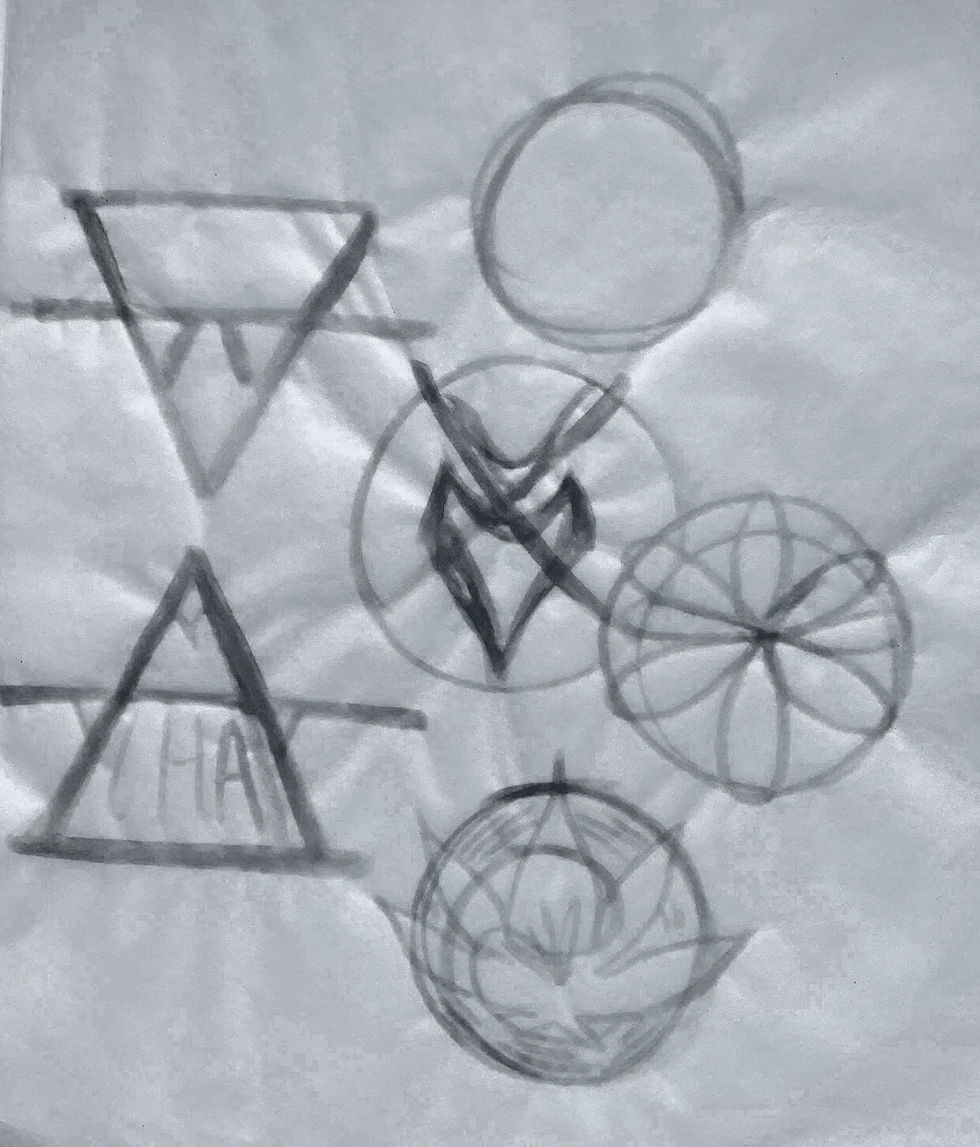
Some of these drawings are very faint on tracing paper, so I've enhanced them for easier viewing:


And this time, I came up with a whole new set of design concepts.

I included some notes on the thought process behind each design:

Then, I had Andrés and Spencer pick their favorite concepts:

Don't worry, some of the designs we decided to hang onto for future projects (stickers and t-shirts, anyone?), so you may see some of them in the pipeline again.
For the final part of any logo design, I try to push the preferred concepts much further than their starting point. Spencer and Andrés’ favorite design, the enso egg, challenged me the most. Again, I felt like I was fighting against a cliché; ensos are very common in the Aikido world—how could I make ours unique? After many, many failed attempts, I thought, Maybe it’s more about the rebirth. So I focused on the egg.
A black void with a crack of potential in it. A new life from a thousand cuts. And then I remembered, of course . . . a phoenix. A wing rising . . . or is it fire?

I sent the designs off—and waited to hear back.

At any stage of creating a logo, I’ll stand behind any and all of the concepts I contribute to a client. I had my own personal favorites, but from a design standpoint, this one is particularly strong. Whether printed large or small, it maintains its integrity. It’s very flexible and can be worked into a lot of contexts and compositions. But most importantly, it has a story: a history that has come full circle and that resonates with the long-term vision of the dojo.
It was my pleasure to be able to give back to the dojo in this way; I hope it serves the dojo well.


Comments